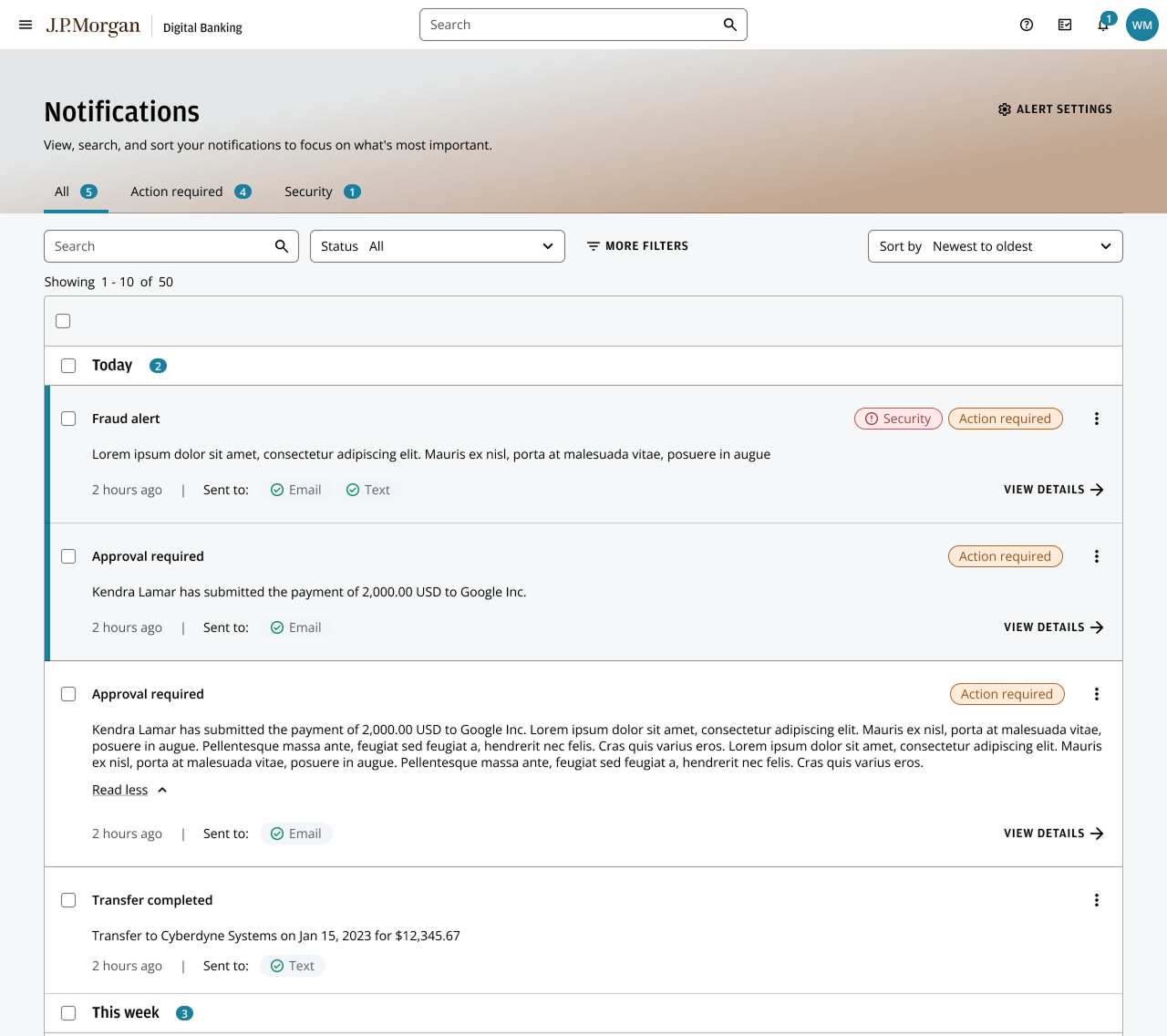
Context
JPMDB was created as a new digital banking experience for Innovation Economy clients, bringing together workflows that previously existed across multiple platforms. As the product evolved, notifications became a critical touchpoint for security, financial management, and client engagement.
However, notification patterns were being introduced inconsistently across products, creating fragmented user experiences and making future expansion difficult to scale. This presented an opportunity to establish a unified framework that could support both client needs and business goals.
- Increase user engagement
- Enhance security and client trust
- Create a consistent notifications experience
- Led the framework design
- Defined notification and subscription hierarchy
- Established reusable standards for future products and notification use cases
What we learned
- 6 user interviews
- Mix of company sizes and financial responsibilities
- Supplemented with feedback from existing JPMorgan products
Based on feedback from existing users of other adjacent JPMorgan products and direct user interviews.....
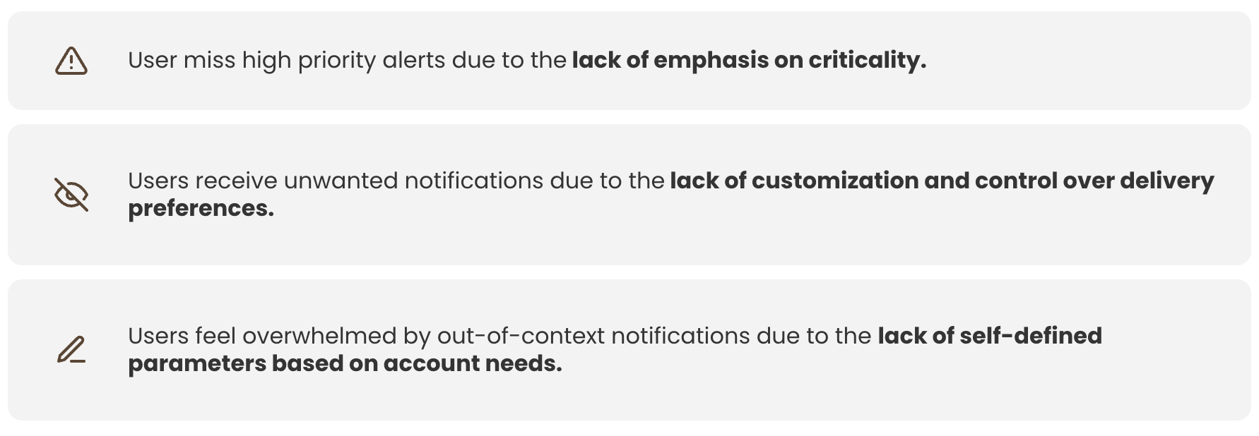
Concluding all of our knowledge and findings up to this point, we summarized three key insights to help us shape our final design direction.
User attention varies by notification type. Clear criticality will help users make decisions.
Customization is key for notifications to send the right message at the right time.
Users are likely to find the right balance on their own with more granular settings.
Designing the framework
Utilizing the interviews, we also were able to establish an urgency framework to determine which notifications are truly considered "things are on fire" vs "look at me later"
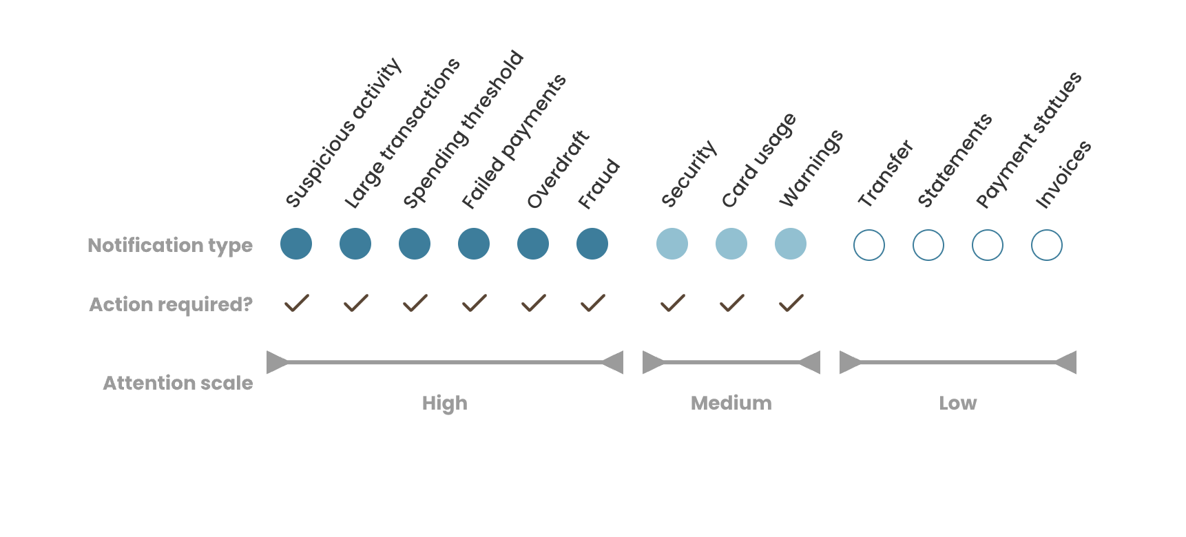
Different notification types require different levels of attention. Organizing alerts by urgency helped users quickly identify what required immediate action versus what could wait.
Research showed notification preferences varied significantly by role and company size. Flexible subscription settings allowed users to tailor communications to their needs.
With 30+ notification types identified, creating a structured information architecture reduced cognitive load and provided a scalable foundation for future products.
We identified over 30 notification types and created an information architecture that transformed a fragmented set of alerts into a scalable organizational model.

After reviewing all insights and resources, I hosted a collaborative workshop with product to ideate design solutions
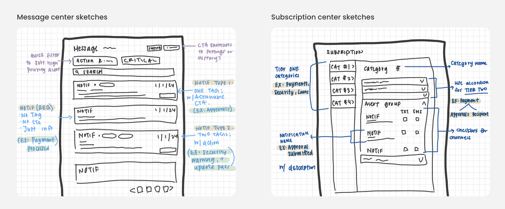
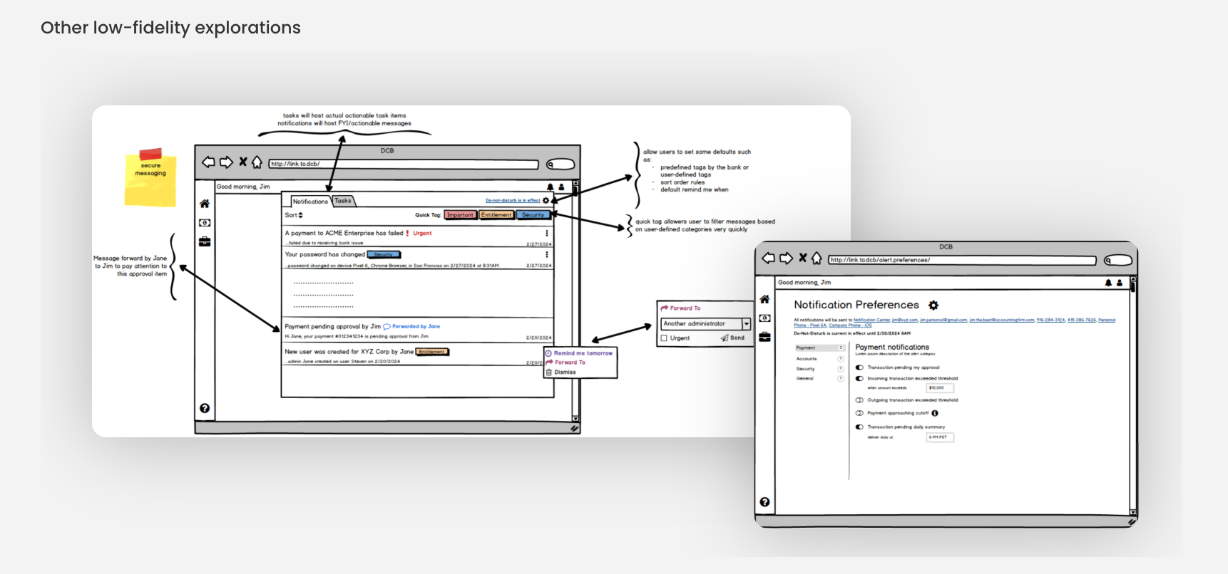
Design decisions in action
Establishing clear design principles help keep the iteration process on track, avoiding revisions that could impact delivery and deadlines.
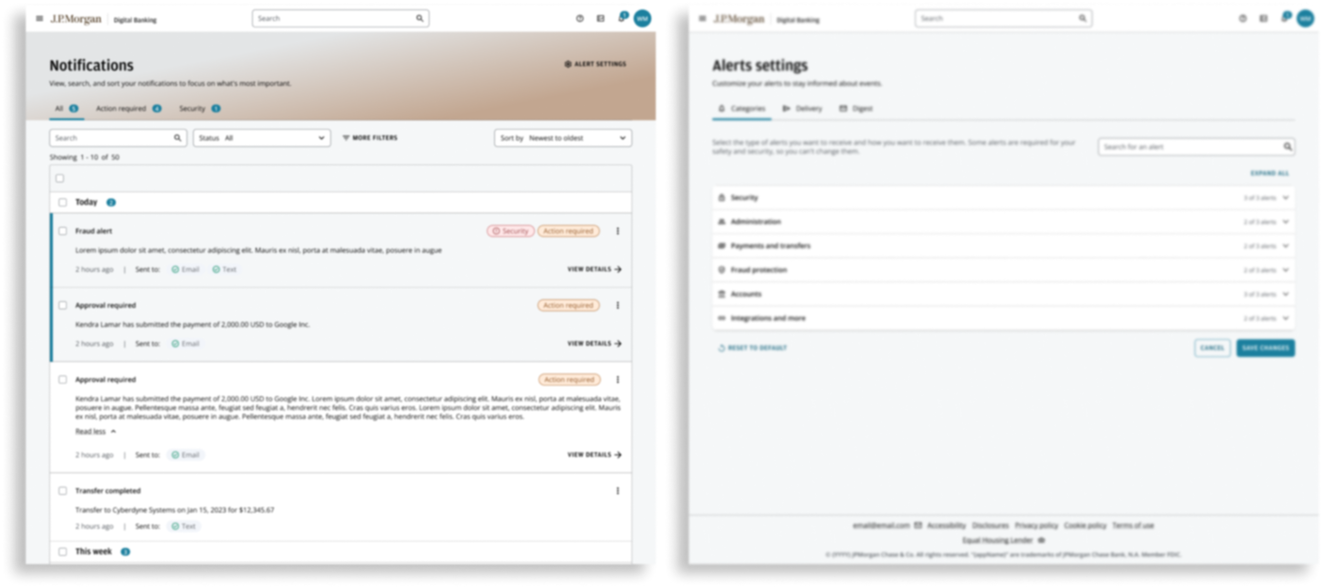
Clear notification hierarchy
Research showed users struggled to identify which notifications required immediate attention. Applying the urgency framework helped establish a consistent visual hierarchy, allowing users to quickly distinguish critical alerts from informational updates.
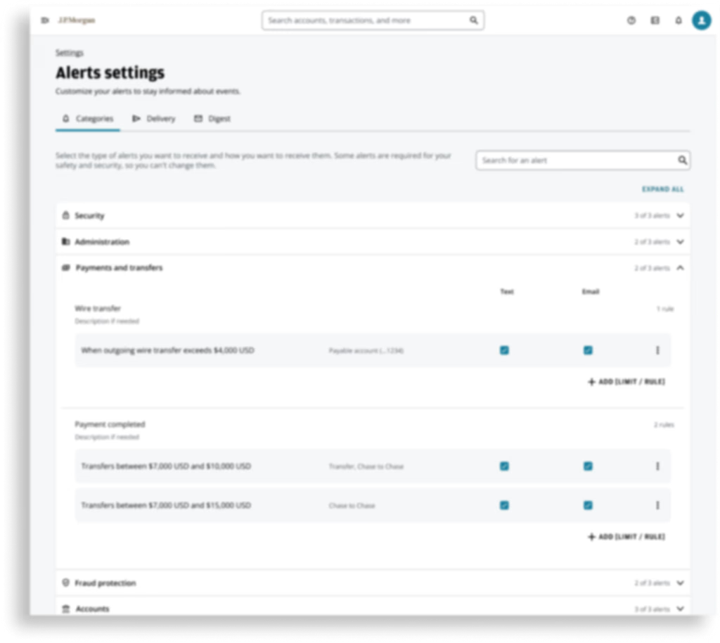
User control through customization
Interview participants expressed different notification needs based on their roles and responsibilities. Granular subscription settings gave users greater control over what they received and how they received it, reducing notification fatigue.
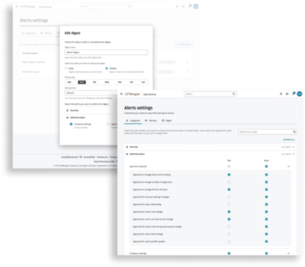
Consistency across products
One of the primary goals of the framework was to reduce fragmentation across experiences. Standardized patterns and behaviors created a more predictable experience for users while making future implementations easier to scale.
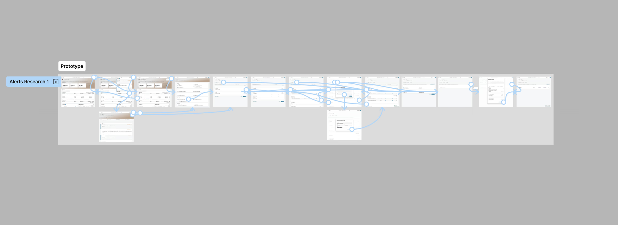
Full interactive prototype and wireframes available for deep-dive during interview sessions.
Usability testing
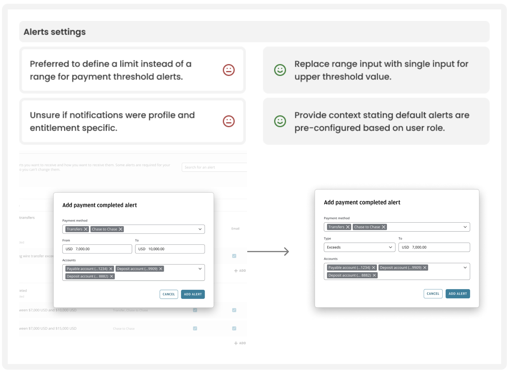
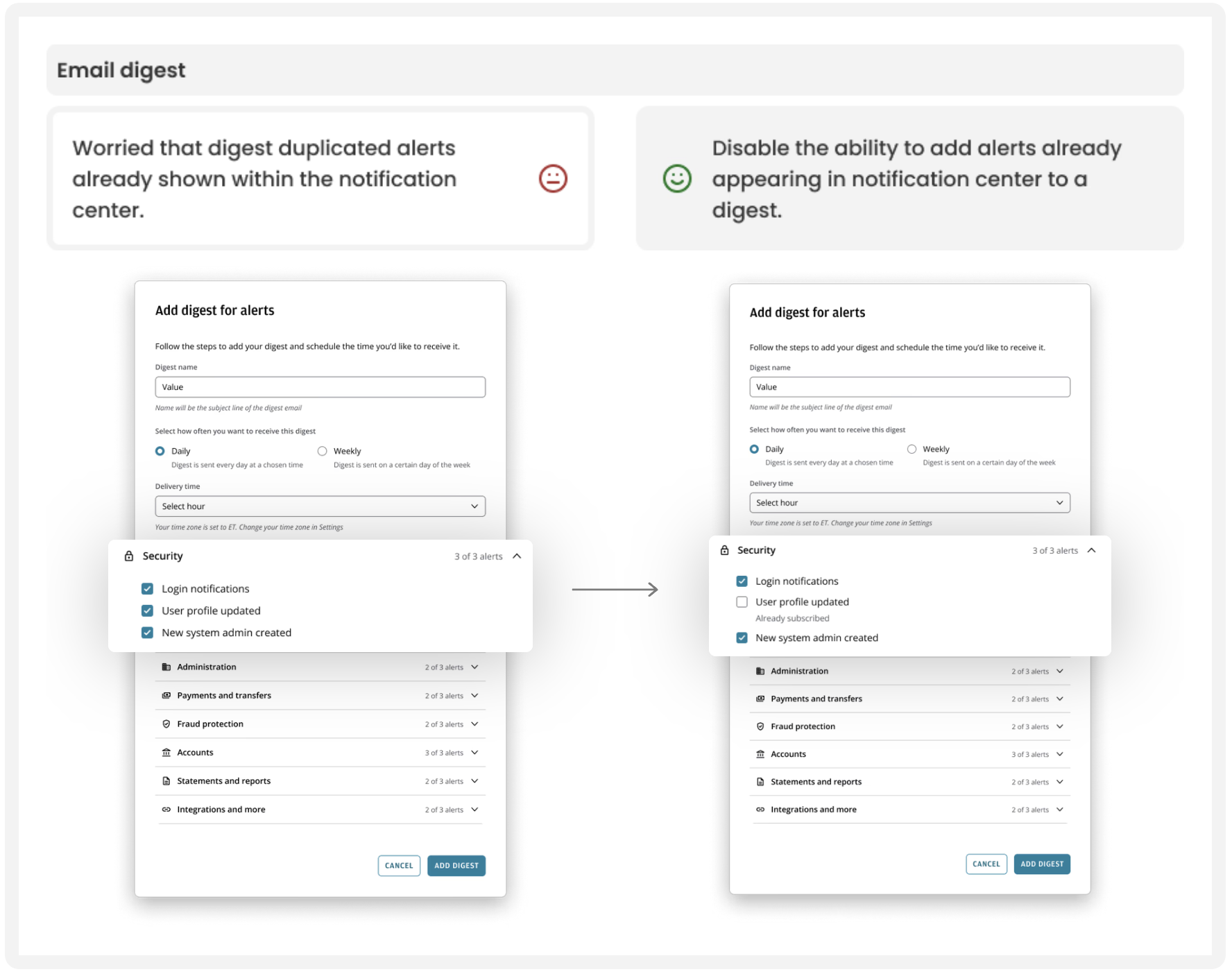
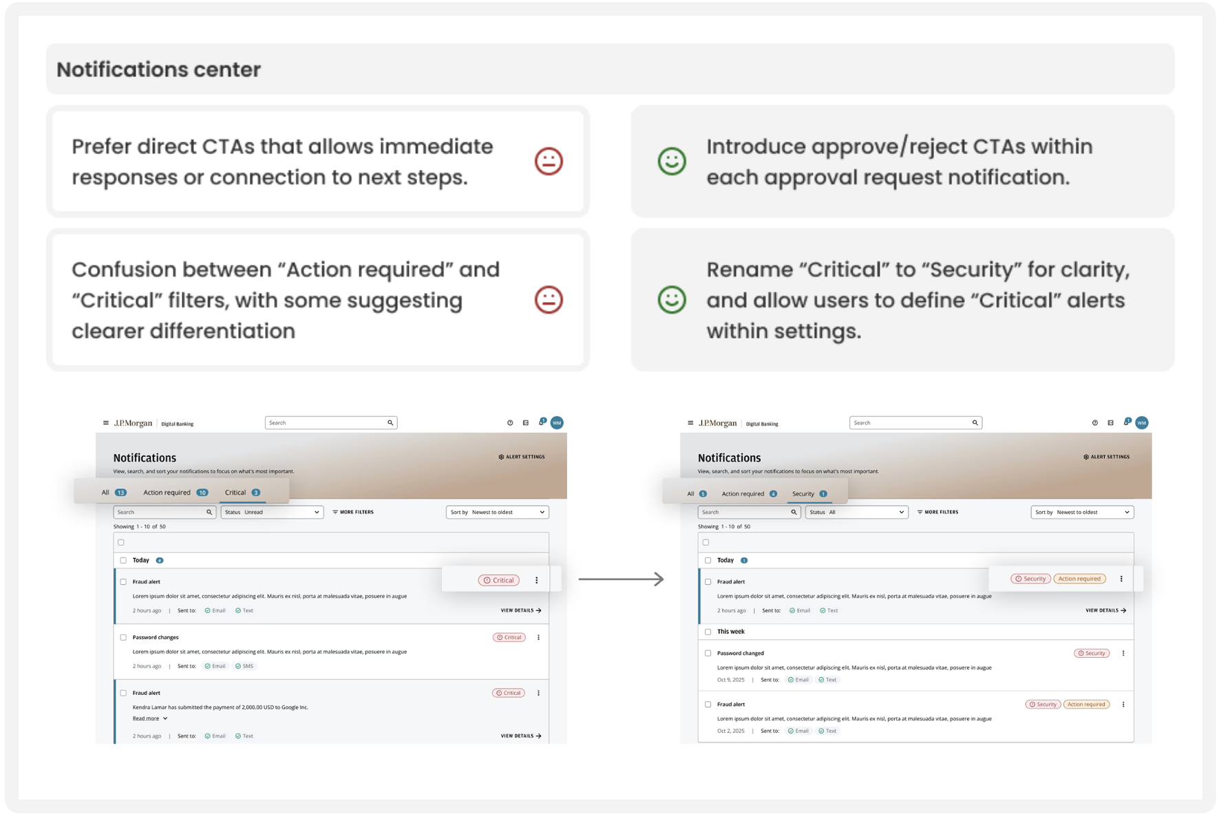
During actual testing, we received 100% user satisfaction, with users finding navigation and groupings to be intuitive, the overall experience easy to understand, and the depth of customization provided.
With that said, there were still areas of improvement needed.
Outcomes
The notifications framework consolidated three separate client experiences into a unified system, creating a more consistent and scalable approach to communication across the platform.
By establishing reusable standards, notification hierarchy, and subscription patterns, the framework provided a foundation for future notification use cases while reducing fragmentation across products.
- Unified 3 notification experiences into a single framework
- Established reusable standards for future products
- Created a scalable information architecture supporting 30+ notification types
- Improved consistency across notification behaviors and user interactions
This project reinforced the importance of designing systems rather than individual screens. While notifications often appear as small moments within a product experience, creating a scalable framework required balancing user needs, business goals, and long-term platform growth.
The biggest challenge was not designing the notifications themselves, but defining a structure flexible enough to support future products while remaining intuitive for users.